I really like Code::Blocks, but after using it for a while, I feel that the user interface could use some improvements. These are merely cosmetic changes and do not affect the overall abilities of the program, but these minor fixes would still make Code::Blocks look more professional.
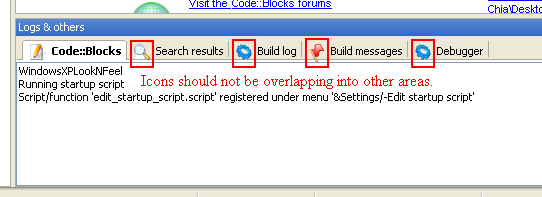
Here, the icons overlap onto the border. Making the tabbed menu a few pixels taller and moving the icons up should solve this. Also, "Logs & others" should be renamed to "Console."
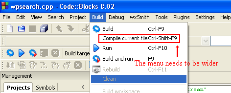
Here, the text on some menus (options and keyboard shortcuts) is too close together. This could be fixed by widening the menus by just a few pixels (about ten will do).
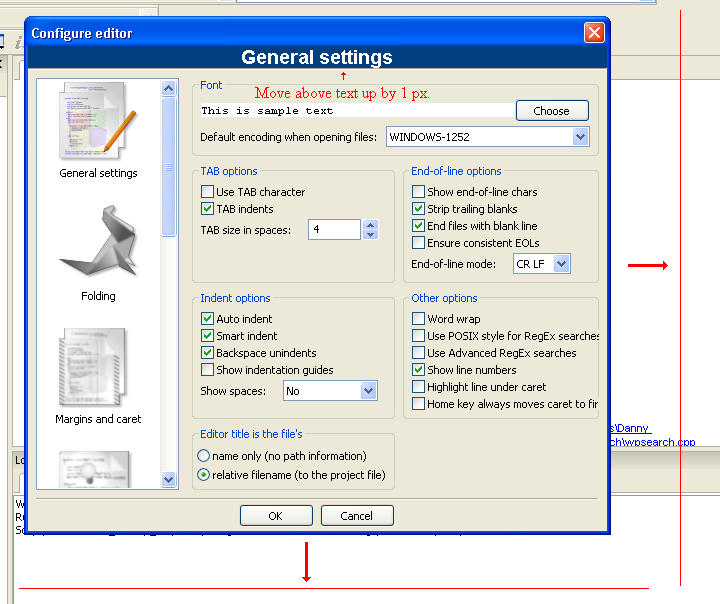
The default size of the options menu is too small. This problem could be easily fixed. Also, the internal title text ("General settings") should be moved upwards by one pixel to prevent it from overlapping.
Other areas could also use some minor improvements. For example, the "X" button (for closing windows) could use a graphical makeover. The Ubuntu version looks much better. Speaking of the Ubuntu version, there seems to be a few cosmetic problems that are only present on the Ubuntu version. For example, the title bar of the debugger toolbar is too small, causing the "X" button to overlap.
That having been said, I'm not complaining about the GUI; I'm just saying that it could be improved!


